Charitize - Web App
Challenge: Build a web app where skills can be exchanged for donations to charity
Deliverables: User research report. Affinity map. Task flows. Wireframe. UI. Prototype.
Role: Product Designer

Charitize is a marketplace where skills can be exchanged for donations to charity.
Problem Statement
-
Charitize had a Wix website with simple form input for volunteers and a listings page for buyers. The old website does not serve the purpose of what client envisions, and there is no means to establish an online community.
-
The donations and coordination between volunteers and buyers has been handled manually by the Charitize team, which makes scaling impossible.
Goals & Metrics
I worked with a team of product and visual designers for this project. By building a web app from zero to one, we hope to:
-
Create onboarding experience for different types of users to join the platform
-
Recommendation system to help prospective volunteers and buyers get matched
-
Create a contained marketplace of volunteers and buyers
-
Streamline the experience for volunteers to select the charity of their interests
-
Help communities to establish with a focus on schools, retirement or religious communities.
RESEARCH
Competitive Analysis
The initial step in our research was to understand successful patterns in current products and missing gaps in unique values. We explored 23 products and narrowed down to 7 top competitors. We analyzed the good and bad of each competitor, and performed our points of analysis on: on-boarding experience, homepage, features, filter system.
User Interviews
We interviewed 7 buyers (who donates) and 7 volunteers who are members of communities. For this phase, I worked on the buyers' team to create interview questions and curate the process.
Target Interviewee
-
A member of a community
-
Who has volunteered or donated in the past
Learning Goals

SYNTHESIZE
User Findings
We Synthesized our findings under five main categories below in order to create a more solid frame and foundation for our design moving forward.

For this step it was important to understand the target user and the specific situation, motivation, and outcome to better comprehend the exact steps the user would take to finish a task.
Some key findings we uncovered from the buyers' side:


Prioritizing Values
The findings from our research were then organized on an affinity map to better understand their relationship to each other and to determine our priorities moving forward in the process. With the two side market connecting volunteers and buyers to support charity organizations, we created affinity maps for each side.


IDEATE
Task Flows
Prior to coming up with solutions we spent some time developing the task flow for buyers and volunteers. We started with discussing stakeholders and end goals, then connecting the two with key interactions a user has with the product.

Design Studio
We did design studio to come up with various solutions, which is an intensive process of sketching, presenting, collaborating, and validating among the team. I focused on the landing page, profile page and reviewing experience when the service is completed.
An interesting issue of split experience vs. dual-sided profile came up while I was working on the profile pages. The question was - as a user can serve as both a volunteer and a buyer, should one account allow for signing up as one role, or switching between volunteer and buyer within the same account? To figure out the best approach, I worked in a sub-team researching dual side marketplaces to understand why a company would do split experience (i.e. Upworks) vs. dual profile (i.e. Linkedin). After rounds of research, review and sketches, we agreed that a dual profile page makes the most sense for Charitize. A good framework was set to start creating Lo-Fi prototype.


Wireframe
We fleshed out the UI sketches, created lo-fi wireframes, and got down the clickable prototype for validation testing. We conducted validation testing with 5 users, and found out a couple of issues need to be adjusted. For example, to make filters more prominent on the landing page so it can give user a clear signal that it is the primary call to action.

Process
Below is the design process through the ideation phase. As expected, the process was more of an organic journey than linear path, consisting of constant revisit of the previous steps and reiteration.

PROTOTYPE
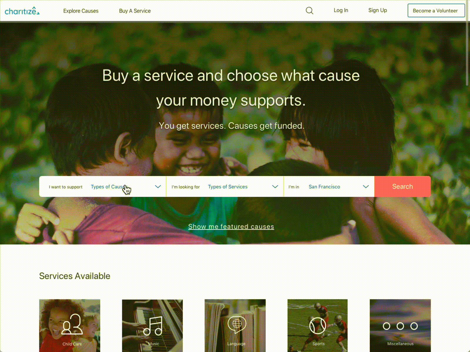
Home Page
After validating our Lo-Fi prototype we made iterations to our design, and moved into Hi-Fi phase. I created Hi-Fi assets for the buyer's flow including home page, sign up process, searching for causes, and scheduling with volunteer.
Clickable Hi-Fi Prototype: https://marvelapp.com/3j560b9

Animated Prototype
To demonstrate the proposed flow when a buyer looking to support a cause, I generated animated prototype with activities from landing on the homepage, selecting cause, service and location, to browsing matched volunteers.
Validation
We conducted validation testing of the clickable prototype with 5 users for each group. Here is a summary of the findings from the "buyers" testing:
-
1 out of 5 users would like to see cities instead of zip codes when selecting location
-
1 out of 5 users didn't pass the task of buying service of a French lesson to support a local high school. User was confused by the filters.
-
1 out of 5 users were confused about the button "Book Now" when browsing matching volunteers. "Am I booking a French Lesson, or am I donating money to her?"
-
2 out of 5 users want to know what the badges actually mean on a spectrum or something more quantifiable when reviewing service from a volunteer.
After Thoughts
With the complex level and short time frame of this project, it is extremely important to stay focus on the most important areas without going too deep in details. Also, when a problem evolves, it is crucial to react timely and reiterate to come up with a solution that allows the project moving forward. For future improvement, I would like to spend more time looking into the filter system, and badge reviewing system to further improve the clarity.