First Derm - Responsive Web App
Challenge: Build an AI dermatology web app that help users assess skin concerns
Deliverables: User testing report. Affinity map. Wireframe. UI. Prototype.
Role: Lead Product Designer

First Derm Skin Image Search™ is an AI dermatology web app that can help users assess any skin concern.
Challenges
-
The current web requires a redesign to make the site look more professional and trustworthy.
-
The AI product requires more images to train the CNN to enhance accuracy.
-
The product is currently a free online service which doesn’t generate revenue.
Goals & Metrics
I worked with a team of product designers and researchers. By building a responsive web experience for "Skin Image Search", we hope to:
-
Improve the web app to create a professional, trustworthy and friendly user experience;
-
Optimize the web experience on mobile devices;
-
Provide instructions to help users take better photos of their skin conditions;
-
Provide users guidance on next steps after reviewing matching results;
-
Harvest more images to help the AI product increase accuracy;
-
Explore various revenue generation opportunities and convert more users to paying customers using the paid service to connect with online dermatologist.
RESEARCH PROCESS
Competitive Studies and API Research
To understand similar products on the market, I did competitive studies and analyzed their UVP, helpful features, and common user complaints. Also, to explore opportunities of revenue generation, we looked into potential API partners for Skin Image Search™ and typical payment structures.
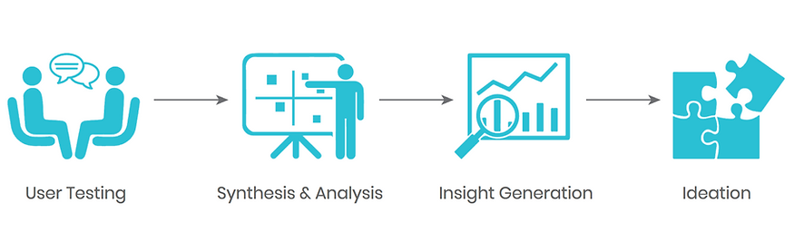
User Testing
I conducted usability testing with 10 users with the goal to find out:
-
What needs and goals drive people to use online healthcare services?
-
What are people struggling with while using the current “Skin Image Search”?
-
How can we build trust with customers?
-
How can we better connect users with doctors?
Synthesis & Analysis
During the synthesis of our findings, I recognized some common pain paints users experienced when using the current web app.

Insights Generation
To determine the priorities, we did card sorting and organized user findings on an affinity map. I facilitated meetings and came up with four key categories involved in typical user journey: 1. landing; 2. uploading photos; 3. seeing results; 4. result details.

Ideation
I facilitated several design sprints with the team, to map out the task flows, and come up with sketch ideas on how to solve the problems identified. We formed into four sub-teams, and I joined the team working on "landing and uploading photos". I created concept sketches, exploring how to streamline the process, provide users clear instructions, and build trust throughout the process.


SOLUTIONS
Lo-Fi Wireframe
After reviewing the UI sketches, I translated finalized ideas into Lo-Fi wireframes, and built clickable prototype for validation testing. One of the biggest challenges we had was - whether to keep or remove the ICD10 code. The client believed it was important to keep the code as it is useful for healthcare providers and makes the web more professional. However, the validation testing proved 5 out of 10 users were confused by the code and had no idea what it means. After rounds of discussions, we came to an agreement to remove the ICD10 code from result page while keeping it in the result detail page. It avoids confusion when user reading the results, while keeping the information available when it's needed.

Hi-Fi Prototype
After validating our Lo-Fi prototype and making a few iterations, we moved into Hi-Fi phase.
Taking the mobile-first approach, I started the responsive design with mobile which has the most limitations to best understand essential features, then translated the design into larger devices.

I created Hi-Fi assets for adding photos, searching and loading results. Also, I explored animation opportunities to enhance the experience while users waiting to see the result.
Clickable prototype: https://marvelapp.com/181ihhg6

Validation
We conducted validation testing of the mobile and desktop clickable prototype with 10 users. Below is a summary of the findings:

After Thoughts
With the web re-design, we are able to significantly improve the site clarity, navigation, and mobile experience. For future improvement I have a couple of suggestions:
-
Consider adding more information such as testimonials, user reviews, press, and other supportive data to build trust with users.
-
During the searching period, users would like to see animation with progress bar. If to add video ad in future it should allow users to skip as needed.
-
When looking at results, additional information communicating accuracy and severity can help.
-
When sending a case, provide an option that allows users to add more photos.
-
For paid service to ask a dermatologist, users would like to understand more about the credibility of the service and insurance coverage.